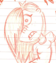
Saturday, 31 January 2009

the modeling begins...

after doing model sheets over and over again to make sure the drawings match correctly the modeling is finally under way...go me...i thought...simple character it'll be done in a matter of minutes. NA AH mate...those dungarees straps are set to kill me...it'll take some delicate tweaking in order to get it right but they will...be...right! anyway im pleased with my current progress and actually how much i remember/am quicker with thanks to the summer project, last terms modelling and reading! reading pays off? who'd a thought?!

so here's some images for your enjoyment

o and a thank you to dan s for helping me out with my images planes...tripped at the first hurdle!
The beginnings: image planes imported and adjusted via the UVs. Beginning model at the shoulder...
After extruding the dungarees shape, merging the verticies this is the outcome when smoothes. Now...several issues. Firstly the hand that was added to the models arm does not match correctly and has some pinching occuring around the wrist. Secondly the pant area joining the upper body and leg geometry is not smoothing correctly, its got some strange creasing happening here. Perhaps more edge loops are required to break up the geometry? Finally, after working one side of the model, I managed to carelessly delete part of the model. I then used the create polygon tool to fill in the gap but when smoothed it doesnt fit into the geometry correctly (the square part on the side of her leg) Again I will try adding more edge loops and see if it breaks up the geometry. 
Overall i am pleased with this first attempt of the model, I can see the shape of my character forming but some mistakes have cost the quality of the model. I will try out my suggestions and if these dont seem to work will start again a little wiser of what to do. 

Wednesday, 28 January 2009

When the day is over..the riggers come out


Yes today was a looooong old day...mainly packed with contextual studies which was interesting to watch and learn about but all the same yet another project has emerged from the depths and theres so much to do for this unit! 
Anyway, before I go into a panic spiral of hellish rubbish...ness...the day became productive when Matt and I decided we'd start plotting the next stage in terms of rigging and worked through a tutorial in my rigging book on creating FK and IK handles for the arms. Success...well....we made both sets of handles but decided not to press any further with making the switch for one to the other as were working on a basic model Matt had made but I think it was very helpful for us both to do and introduced us to a bit of MEL scripting (which up until now...i'd quake in me boots at if someone mentioned i'd have to do it) well MEL....you...don't...scare...me. Unfortunately I haven't got any images of the controls we added as Matt didn't save the model (silly Matt). We also started looking at different controls that could be put into our characters and discussed what we thought we might need so our time would be used wisely when acutally rigging instead of making all the controls under the sun and never actually using them. I have now bought another book on rigging (i must....learn.....i.....yeeeeerrrn for knowledge on ze rigging o maya lord) which has much more advanced rigging in it...have had a brief look but trying not to read everything and do nothing at this stage!
I now have a back up plan if my rigging is taking too long and have decided I will stick with FKs for arms instead of having both FK and IK. I can always return to my model and update it in the holidays.
Anyways this has been a short broadcast to illustrate my growing confidence in rigging. If I actually manage to do it...thats another big goal ticked off of Sarah's Maya target list :)

Here's a quick rig plan i completed when I got back home. This will give me an outline of what needs to be included for character setup but could change if I realise any controls need to be added/reduced depending on time constraints/characters requirements. 

its just bananas?!

extras required for the scene are very few and far between inlcuding a banana and a chair but i thought i'd get a head start on the modelling to save time. Infact this took less than 10 minutes so yeah bang...job done...nothing ooo wow but hey, i've been working damit! 
so here's the process from chimpan-a to chimpan-z (ha)
a. initial shape of the banana created out of nurbs circles
b. lofted surface
c. lofted surface copied so its not affected by movement of curves
d. converted to polys
e. smoothed with gaps filled
f. smoothed once more
NB:// will need to experiment with textures later on but at least the initial model has been created...colour added to a lambert shader.

I have also modeled a basic poly chair for my scene, which again will require texturing and probably scaling so its correct size for my character. At least these short tasks are complete and ready to go once i need them...i would texture but at this stage the character rightly requires my attention atm!

thumbnails

heres some thumbnails of my story idea for the animation...they're extremely rough but its got the rough idea out of my head and onto paper :) Of course this will be subject to change depending on how much time there is left to animate/how well the rig goes etc


back to the future...i mean...pocoyo look

so after my attempts at re-creating the Pocoyo style, i realized i was out of my depth in terms of lighting/rendering knowledge. This is a weakness of mine i hope to strengthen over the course of the...course....ahem, but anyway, I showed Mr Grigsby (whose expertise in Maya are legendary) and explained my renders meant the lighting was too harsh on the subjects and when trying to add to the occlusion layer it meant the brightness was too much. He then showed me a way of flooding the scene with a more natural diffused light that led to a softer render. After taking some notes, I returned home to attempt the scene again.

Aaaaaaaand the result?
Weeeeell its looking better but I think it could look even better with an actual plastisine texture added to the lambert instead of just a colour...perhaps texture layering might add to the thick texture quality too? More experiments to come but I really should get back to my character...its good to start thinking about the next stage though!
Heres the added occlusion and render pass in after effects...as you can see...still too bright...more tweaking with the lights is needed in Maya

and heres the same render after a brightness tweak in after effects. This is more of the look I should be aiming for, however I hope I can sort out the lighting in Maya rather than adjust everything in post! Progress occurring don't you know
Heres some more tests:
Lowered the light intensity to 0.6 and occlusion and image added via the screen option in after effects. Looking better but still a little washed out colour wise. 
Light intensity lowered to 0.4 in Maya. Occlusion and image render added via add in after effects. Not a great deal of difference between this one and the previous...lets push it some more.
Light intensity lowered to 0.2 in Maya. Occlusion and render image added via lighten option in after effects. Looking better, seeing a lot more colour from the objects here yet still seems slightly washed out. Further tweaking to continue. I think the tests might be a bit more successful if the shapes are soften a little. Perhaps try photographing plasticine and applying it to the shapes in different colours...see if that makes any difference to the overall look. Bump mapping might also help at this stage.

Sunday, 25 January 2009

Final Design...Model Sheet

here she is, the final miss pocahontus:

aaaand the model sheet ready to be imported into Maya to begin modelling with :)

recreating pocoyo

Ok so I thought the best way to find out the technique would be to try and recreate the render style used in Pocoyo. That way I can use the same techniques when it comes to lighting/rendering my piece. Now I have absolutely NO background knowledge on lighting/texturing/rendering so hey...we're off to a good start...pffft. Anyway I constructed a simple set in Maya resembling that used in Pocoyo and after a chat to Mr. Grigsby heard of rendering with global illuminations:
".........yes" i said...it was a school childs pasta face project...completely blank. 
However after opening the old book on texturing and lighting as well as reading on the Pocoyo blog they used global illumination, I have started to fiddle round with the process.  Its looking quite crap if I do say so myself...but...its a start (I keep saying that I know) and hopefully something will click with a bit of tweaking. However, another spanner in the works as I continue to read on about another technique called final gathering...the two processes seem the same except final gathering is supposed to allow a slight bleeding of colours onto nearby surfaces as well as brighten dark areas with bounced light. 
And now....some images

Heres the set (o wow aren't you impressed! hahaha) Yep 3 planes and a load of poly cubes shapes to look like building blocks. Scene is light with 1 spot light

Ok so here we have combined occlusion layer and render pass of the blocks. Scene was lit here with two directional lights from left and right to get rid of shadows....I've just remembered I probably left on Maya default lighting so that could be why its so bright when the two layers were added together in After Effects...idiot. 

Ar yeah another test which after having the realisation about the first would sort of answer that...I'd got rid of the directional lights here and kept the remaining above spot light. Added occlusion layer to the render pass by way of lighten and you get this...strange outcome....idiot.

Here I've turned off Maya default lighting and er...it seems to be no different so I take it further tweaking is required tsk...never bloody simple these things ay. It actually seems to be worse with the spotlight.

Next attempt, I've got rid of the spotlight and changed to 3 directional lights to represent the key fill and er....third light whose technical name escapes me at present (yeah thanks a lot brain...werhey to embarrassing me on that one). So the lighting appears to have immersed the scene in white which I suppose is on its way but could be because the lighting is so harsh. 

It was then I realised that each time you change the lights you have to reset the caustic and global illumination settings in the attributes editor...idiot. I dunno...I really havent got a clue here!

Glen Keane

I've been attending the first years life drawing sessions to get back into the swing of drawing again...having no had a lesson since 1st year (the maquettes class clashed with my groups sessions last term) I feel I'm very much in need of some practise to help with my quick sketches for getting my character designed as well as for when thumb-nailing my story for the animation. How are they going? weeeeeell not very well at the moment but Im slowly getting back into the swing of it. 

Anyway whilst tutoring, Dan Dalli showed the first years some storyboards from Disney's Tarzan completed by Glen Keane. As you can see from my images below these are quickly established sketches but they capture so much in terms of pose and emotion between the two characters of Jane and Tarzan, we instantly know whats going on in this scene just from flicking through. 

I've included a few boards from the scene on here so you can see what I mean, might be helpful for posing your characters. There are loads of boards in the sequence (really fantastic drawings if I havent stressed it enough already!) so Ive just posted a few on here but if anyone would like the PDF to look at just ask.


designing Pocahontus

right...so on to the design of pocahontus: the 7 year old child who would like to be a gorilla. I found it quite difficult to get into designing a young girl as found my knowledge was limited. How do you make someone young? What do young girls wear? How do they have their hair? Not to mention these specifics, the look has to also reflect a claymation style...so simple shapes, no vast detail amongst costume, no human qualities such a muscles. I would also like to put my own spin on the look so its not just a typical Aardman copy. I looked at a few animations that demonstrated children in them such as Boo in Monsters Inc, the dead girl in Corpse Bride, Little My from The Moomins as well as Hoodwinked's Red and One Man Bands Little Girl. I also looked at the strange dutch children in Hookwinked for costume inspiration: Images are are taken from google, my own screen prints and images of Boo taken from the Pixar Book "To Infinity and Beyond"

Stereotypical designs of young girls are to have big eyes, tiny frames, pig tails, dungarees but as you can see from my sketches below, i wanted to try out a few possibilities to make sure i was satisfied when i chose my final design. 
So enough chit chat, heres my conceptual work...enjoy:


first lot...i wanted to capture the fact poca wants to be a gorilla through the reflection of her design...it did go off on a bit of a tangent where she looks like a wild child/tarzan type...but i was soon swayed back on track to treating the project brief like a live one and thus the character design.
second lot...dont ask..sometimes i draw on tracing paper...anyway i was experimenting with face shapes, simple shapes to construct the hair out of. 

third lot...starting to narrow down a design here...it helped me to make a list of her characteristics and then draw as well as list clothes to try out a few outfits....i think some of my drawings might seem a little limited as im always thinking of the next stage and know what i do and do not want to take into Maya...above all...i want to keep it simple...its too easy to get carried away. 
Colour research. I know Pocahontus is bright, curious, energetic, sweet above all a young girl so its a good idea to start considering colour now. Heres some quick colour samples i completed....i then went into the mass store of plasticine i have under my bed (dont ask) and found the colours appropriate. Plasticine tends to be more the brighter shades of colour...its interesting from photographing the blobs to see how light falls across them....will be useful for texturing later. 

rigging practice

So i guess I've been working backwards in order to help me go forwards on this project. Sounds a bit strange? Of course it does but then I guess you have to start somewhere!

For the summer project I worked on a character that I didnt manage to complete but had modelled the body for. It was annoying at the time not to get the next stage....but its actually a good thing now as it was perfect to use for practicing rigging. I've been using the pdf tutorial given to us by Dan Dalli last year buuuuut its very basic and will only get you so far in your understanding. If anyone would like the modeling rigging, modeling eyes or the basic nurbs modelling pdfs we were given last year, just let me know and I'll bring them in as I dont think there on Moodle anymore. My new talent is bugging Dave with q&a sessions (sorry Dave) as he completed rigging for last terms project Cribbin. He has recommended some very good tutorials which he's included the link for on his blog. I also have An Essential Introduction to Maya Character Rigging which I bought off Amazon which helps you model and rig your first character, explains blend shapes, painting weights as well as touches on some very basic texturing (if anyone wants a bit more info...I've usually got the book on me if you'd like a look)


As an animator I found the character setup of maxformaya nice and easy to use. All the appropriate handles and facial controls were there on display meaning not having to search for any blend shapes or controls (except extra foot and finger controls). Setup includes different colours to help separate the left from right controls. I thought I would include it in my research as its a character setup I would like to achieve for my character. The best research you can do into rigging is looking at different pre-rigged characters to see the different IK/FK setups and joint chains. The job of the rigger is to aid the animation process. 

Last term I did a bit of rigging on the spider character. However this was very limited as the model was basic and had to perform only simple tasks such as walking. Its blend shapes were also basic, having only an extendable eye piece and blink operation. Nevertheless it was still experience in quadruped rigging setup but the character would have benefitted from IK handles to stop it from slipping through the floor all the time. 

Anyways I thought I'd include some images on here to show you what I've been up to as its apparent it looks like I've done very little. Preparation is key folks though I do admit needing a good kick up the arse as well. 

Heres the different view points of my character (supposed to be the laughing policeman) but dont be fooled, I've only attached the curves for the root as well as the IKs for his feet. Attaching the other curves is not so simple though as parenting deletes its heirarchy joint in the chain. More reading needs to be done! You can see I wish the layout for my character to be like that of MaxforMaya character rig as shown above. I can tell you now...dont make a fat character unless you want to be there for aaagges sorting out the painted weights...keep it simple folks. Short, fat characters can work, but have limited movement so your character would need longer arms to compensate. Oh yeah another quick note. DO NOT smooth out your models before rigging as it makes the process difficult especially when it comes to painting weights. Ideally you want to figure out how to have a low and high poly switch of your model so there's the option of rendering it high quality without slowing down your computer with the high resolution.
Here I was working on the reverse foot system which at first I thought would have no benefit on the model but actually it does. It allows the foot to bend and flex correctly when sliding the IK handle forward and backwards. Defiantly worth putting this in my model for this project. Below you can also see the joint orientation of the setup which is not correct as the XYZ are all over the place and should follow a pattern. If joint orientation is not correct, it means the model wont rotate correctly when the rig is bound to the model which will cause problems when it comes to animating.

Thursday, 22 January 2009

the 11 second club

This may be taking a slight detour from the current project but since there seems to be a few keen animators amongst the group and there have been mumours of little chance to animate etc I thought I'd post some information about the 11 second club.

The 11 second club runs a monthly competition thats open to anyone to enter. Each month a new piece of dialogue of guess what...11 seconds...is available to download and animate to. You must join first but then your free to enter your animation and vote for your favorite. If you win you will receive an eCrtique (webcam feedback) from one of the professionals at the renowned Animation Mentor!


Anyone whose unaware of what animation mentor do, they're the online training school that solely specialize in animating. Tutors come from all parts of industry including Pixar, Dreamworks, LucasArts Studios, Walt Disney Animation Studios, Sony Imageworks, Industrial Light & Magic, Tippet Studios, Reel FX Creative Studios, Blue Sky Studios, Weta Digital, Digital Domain, Rhythm & Hues Studios, just to name a few! I know there's a few ravers wanting to join buuuuuut its gonna cost ya a mere $17,425! Oh yeah! Thats £12,607 under the current conversion rate...hmm...i guess they wont negotiate their prices even with the credit crunch! *sigh* Check out the website, their show reel might give you some ideas for your own.


However, going back to the 11 Second Club...
Join up and give it a try...there's only 9 days left for the January competition but you can still download the audio file and get yourself some free rigs from the resources page. Even if you dont enter your piece, it could provide you with some more pieces for your own showreel. What have you got to lose?!

Here's last months winner:

Defiantly watch last months eCritique from Paul Allen whose worked on project like Jimmy Neutron. His feedback goes into a lot of detail into acting techniques including the theory of neuro-linguistic programming (NLP) which you can find some articles on and read about: 


Heres the link to the eCritique:

claymation meets cg

Here are some examples of how CG has adopted a claymation style as well as looking at its animation techniques.

Pocoyo
Spanish animated series for pre-school children created using the software Softimage but principles could easily be transferred to Maya. Pocoyo draws in audience attention with its bright colourful characters and no backdrop sets. A simple set up which reflects the style of the characters who are constructed from smoothed simple geometry. I very much like the animation style of this piece as well as there's some nice exaggeration such as falling on his head plus some sneaky subtleties like Pocoyo running on the same foot yet its unnoticeable to the audience. Nice added features such as Pocoyo's hat moving to represent expression as well when he's running. Characters are kept to simple colour schemes that have nice reflections of light to give them their 3D look. I will need to research rendering qualities in order to achieve a similar look.


Flushed Away
It seemed a match made in heaven, the masters of claymation (Aardman) meeting with one of the top heavy weights of CG (Dreamworks) to create Flushed Away. Yet theres something too sterile about the characters...they dont look as inviting or charming as their claymation predecessors. Granted I havent seen this film but I just have an instant dislike to its look plus we can predict its success considering the two companies terminated their contract with each other straight after this film considering they were supposed to work together for 3 years or something. It has embodied the look of Aardman but is missing its depth and wiggly fingers that gave Wallace and Gromit delightful british charm. From this trailer as well there appears to be no thought into a style of animation, there appears to be no exaggeration or playful qualitites with the models that break the mould. 

clay-mania-mation

Its funny that this project has come about really. I (like probably most children) watched all the classic Disney films, but it wasn't until I saw the Wallace and Gromit (Aardman) shorts that I really considered the world of animation. I suppose you could say Wallace and Gromit were my initial inspiration for wishing to persue a career in animation. 

Here are some clips of example claymation that might help inspire my character for this project.

Creature Comforts
The original episode by Nick Park made in 1989. A great example to look for looking at different character designs. Simplistic shapes with a reduced palette of colours help create the look of the characters as well as the traditional Aardman style eyes and mouth. There are a mass of limitations when making characters in clay, If characters are too tall they can easily topple unless they have quite an advanced rig so you'll notice some of the bigger characters such as the gorilla and the jaguar are propped. Characters also have to built up with clay so when they are being handled their skeleton does not appear through their geometry. In earlier episodes such as this one, you can see dents from where the animators fingers from where they have been pushing the models around into the desired poses. Not sure how this would transfer to 3D precisely. Finger prints could be a possibility but might look a little odd if not combined with the dents otherwise it'll look like there's flickering occurring on the texturing. Anything textured on the creatures such as shells are indentations made straight onto the clay instead of using another median. 


Pingu
Pingu again demonstrates nice simple characters with limited colour palettes as well as nice examples of exaggeration in its animation style in terms of morphing. It would be nice to include principles like this in 3D with good squash and stretch to keep the characters quite fluid in their movements. Good examples of how foley can help aid the animation in terms of the feet slapping.


Aardman's advert for Change for Life which incorporates very simplistic colourful characters amongst a 2d background which gives an interesting play on dimensions. Characters again demonstrate morphing abilities and even without real faces are able to express some basic expressions and are appealing in their bold colours. Theres a great handmade quality to all these pieces which I think would be good to incorporate into my own work for this project. 


Chicken Run by Aardman...again (o they are the gods of clay aren't they) Showing a nice combination of claymation characters into realistic constructed sets as well as cloth on character. There's definitely a transition of progress between Aardman's earlier work to its more recent but this could also be to do with the difference in animated shorts and features. Again typical Aardman facial features occur and designs still reflect simple geometry. 

Coraline 
I wouldn't say this was the exact style of claymation I wish to reflect in this project, but Im looking at all the options here and Henry Selick's (director of The Nightmare Before Christmas) new film is pretty much the contrast to the look of Aardman. Its adopting (though I dont see his name anywhere) a more Tim Burton approach to its design with characters with who are taller and longer in their features. Such designs wouldn't work in straight claymation as Im sure these designs have pretty advanced rigs inside to keep them steady. The movement does demonstrate some jerky qualities but overall this does tend to favour a more computer generate look rather than traditional claymation. Characters are more detailed than those of Aardmans yet there is a nice play on shapes. No extreme forms of exaggeration in terms of characters morphing to reflect clay.


Purple and Brown
O yes...I can see why our tutor Jared finds this entertaining (simple things!) but yes, very entertaining and again very simple layout. No dialogue so everything is based on the interaction between these two characters. Again there is no set, so the focus is on these two characters and the stupid antics they get up to. The characters themselves are probably the simplest shapes you can get but allows for some great morphing of their bodies as well as interesting walk cycles and distribution of weight. Again typical features from Aardman of the eyes and rubber lips. Characters are kept to a simple base colour